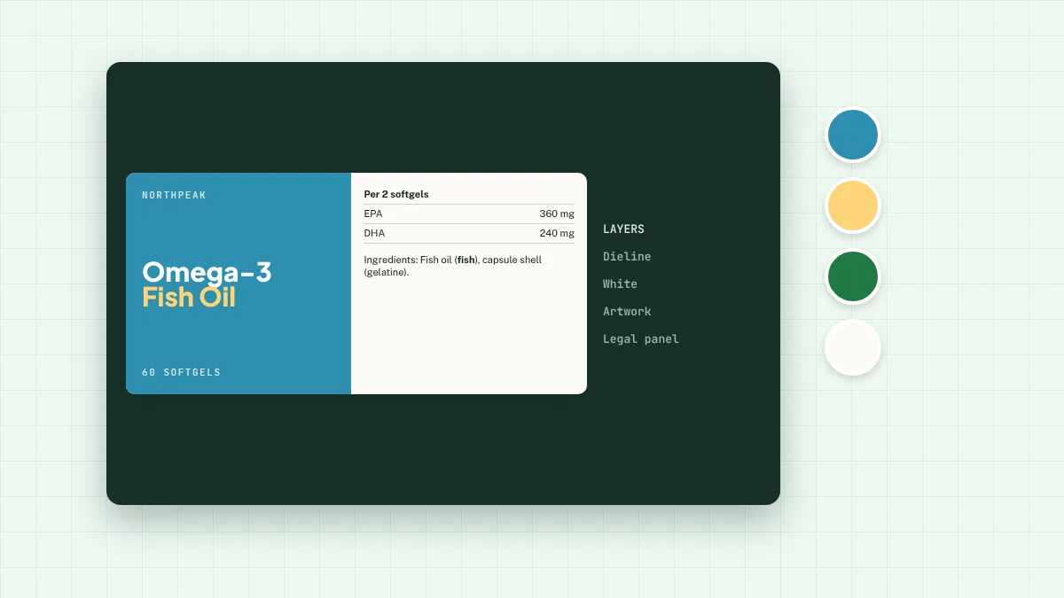
The front: three things only
A shopper should see the brand, what the product is (“Vitamin D3 + K2”) and one reason to buy (a claim or a dose). Everything else competes for attention. Put the net quantity and “food supplement” on the front too.
Colour-code the range
Give each benefit or product line its own colour and keep the layout identical. Shoppers learn the system, and adding a new product becomes a template job.
Design the back panel first
The legal panel sets the size of the label. Lay out the nutrient table, statements and ingredients at a legal size first, then design the front with the space that’s left.
Contrast and legibility
Light grey text on white and white text on pastels both fail legibility. Mandatory text needs strong contrast, not just a big enough size.
Test on a real pack
Print the proof at full size and wrap it round a real bottle. Things that look fine flat often disappear round the curve. We send to-size proofs for this reason. See our design service.
Not legal advice. This guide covers the general rules for food supplements sold in Great Britain. Check your own product with a regulatory adviser, your local Trading Standards team or your Primary Authority partner.